Designing to support user agency
In my Master Thesis, I explored and redesigned design mechanisms on Instagram for a greater sense of user agency.
Team
I worked in this project on my own. My academic supervisor and sparring-partner was Eva Knutz. Please do reach out to me if you are interested in reading the whole study.
Background
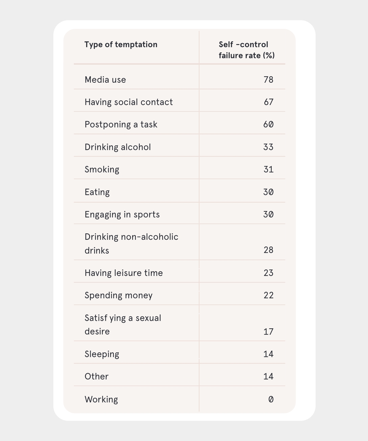
Information and communication technologies (ICT) are designed in a way that makes them exceptionally hard to resist. While people’s failure rate is 31% for smoking and 28% for drinking alcohol, they fail to resist media use 78% of the time (see figure). This is because design mechanisms such as push notifications and autoplay create task interruptions and task-irrelevant thoughts that put an additional strain on the self-control capacity of media users.
This loss of agency that users experience over their technology use comes with detrimental effects on their well-being. Short-term effects such as feelings of fruststration and guilt often translate to more long-term decreases in cognitive well-being, including behavioral addiction and reduced life satisfaction. I therefore asked:
How can we design interfaces that give back control (i.e., user agency) toward the people who interact with these interfaces?
Process
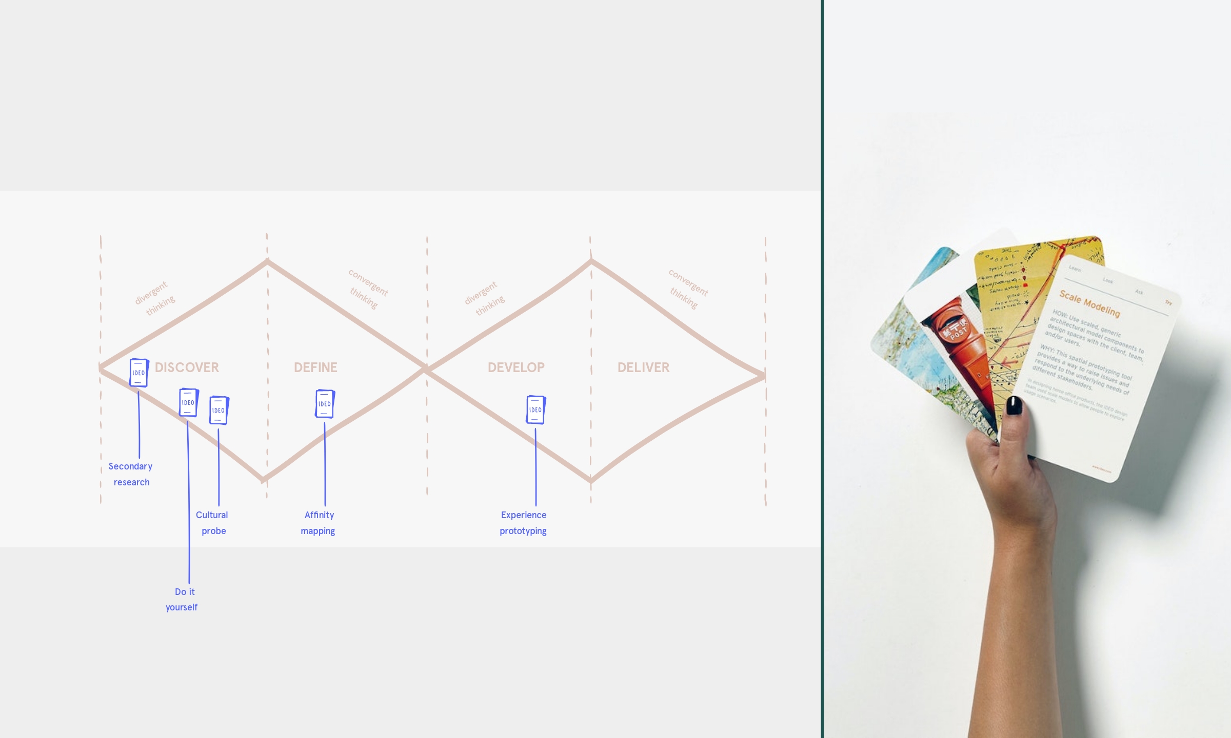
I. Overall research process: moving from exploration to ideation
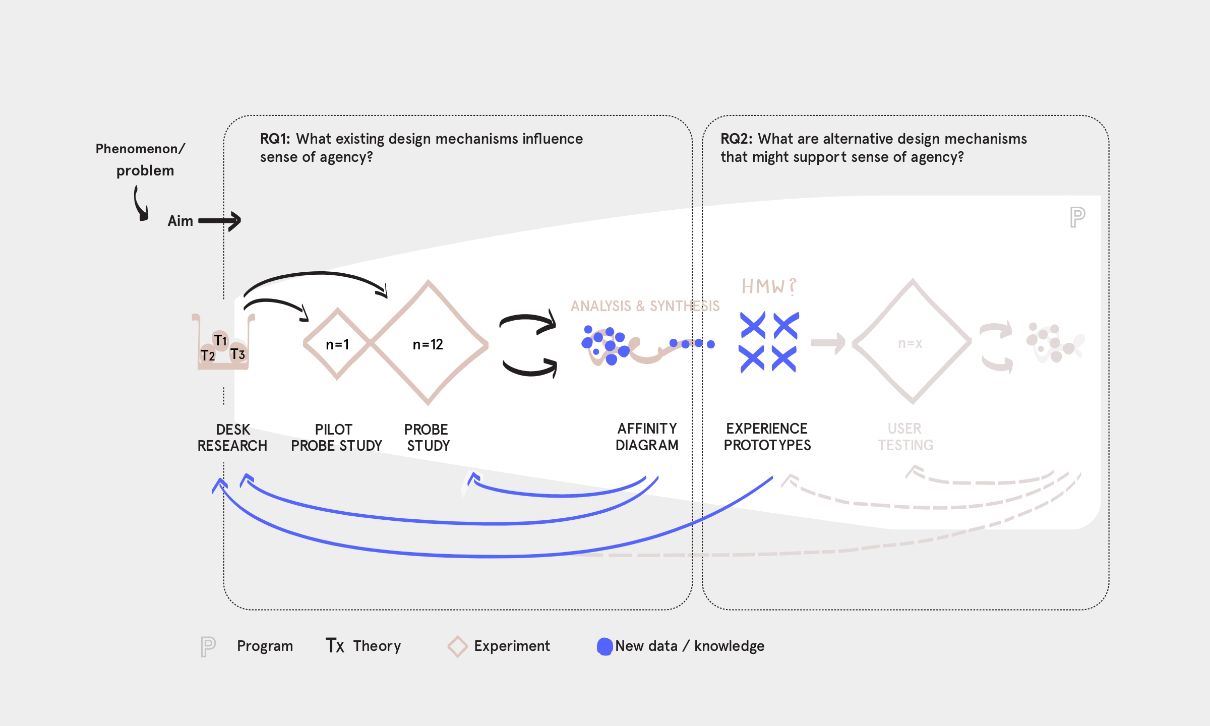
To answer this question, my research study design followed a design thinking process (see figure). I also used IDEO’s method cards to come up with suitable methods for the different phases of my research. Regarding the Discover phase, for example, I gleaned inspiration from the following three IDEO method cards: Secondary research, Try it yourself, and Cultural probes.
Analogue to the first Diamond of the design thinking process, I dedicated the first part of my research to exploring and understanding the problem. My research question was:
RQ I: What existing design mechanisms in the Instagram mobile app influence sense of agency?
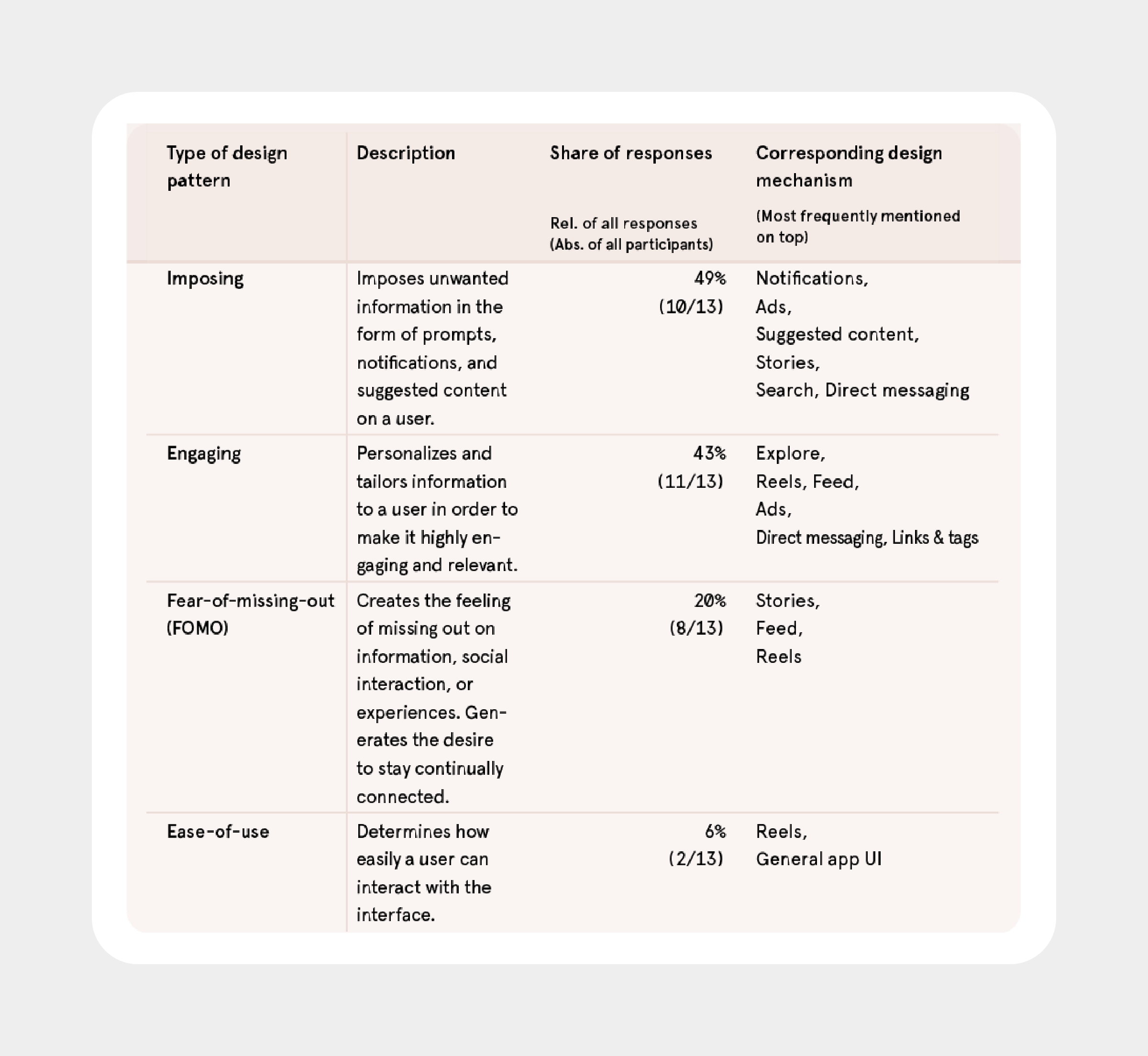
The inquiries in this phase included desk research, a probe study and its analysis through affinity diagramming. The results revealed distinct design features across Instagram’s design mechanisms that made participants feel less or more in control. I further identified 4 higher-level design patterns that describe how these design mechanisms undermine user sense of agency (see figure, visualized by four spherical shapes). The results informed my second research question:
RQ II: What are alternative design mechanisms in the Instagram mobile app that might support sense of agency?
Analogue to the second Diamond of the design thinking process, the second part of my research process was concerned with finding solutions through ideating. For this, I developed four How might we (HMW) questions. Each question was based on one of the four design patterns for low agency. After generating a wide range of ideas, I chose to continue with one idea for each design challenge which resulted in a total of four experience prototypes. For potential inquries in the future I propose user testings to test whether the developed experience prototypes successfully support user sense of agency (see figure, visualized by using lower contrast).
II. Discover: From desk research to intervention
I began my project with desk research, exploring the following three research areas: dark patterns of interaction design, philosophy of technology and previous work on sense of agency for well-being. The results contributed an essential component of groundwork to my research and informed the further course of my research process. For example, there is a need for research to identify and examine design patterns that manipulate users into spending time and attention in an app against their best interests (so-called attention capture dark patterns). 2
I then designed and conducted my own intervention: a probe study with a total of 12 participants. My aim was to collect user experiences and form an empathic understanding of how existing design mechanisms in the Instagram mobile app influence user sense of agency.
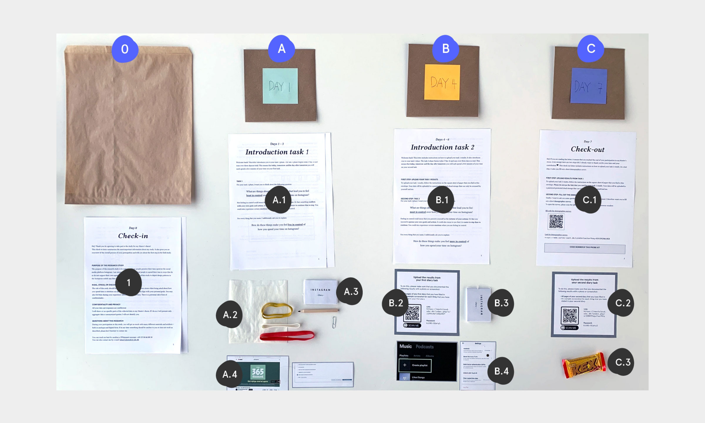
Each probe kit included 2 assignments and 2 corresponding diaries (see figure). The first assignment asked participants to name and explaing things that made them feel least in control (LC) of how they spend their time on Instagram. Thereafter, the second assignment asked them to name and explain things that made them feel most in control (MC).
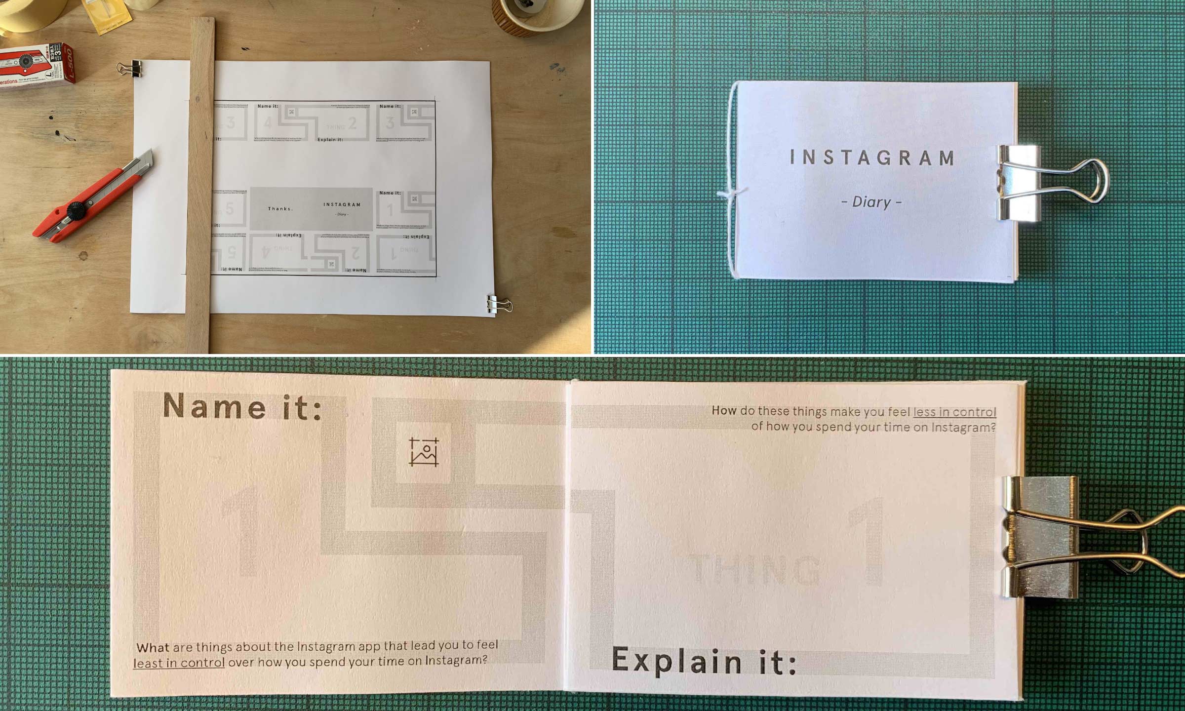
Besides the diaries, each participant received a number of other materials (see figure). For example, the probe kit contained rubber bands to attach the diary to the back of a smartphone (see figure, A.2). This way, the diary accompanied participants in their daily routines.
Learnings
Probe studies require considerable time and effort.
I underestimated the time that was required for participant recruitment, material preparation & shipment and on-going communication with participants. Moreover, almost half of all participants delayed the start of their assignment phase due to personal reasons. Also, since my sample included participants from different countries, delivery times varied and participants received their probe kits at different times.Instructions must be well thought through and leave no room for interpretation.
While I committed a lot of effort to create comprehensive and clear instructions, some participants sought my advice during the assignment phase. I was particularly surprised that one participant did not understand how to attach the diary to their phone even though I had created step-by-step illustrations for it.
III. Define: Bringing all the data together
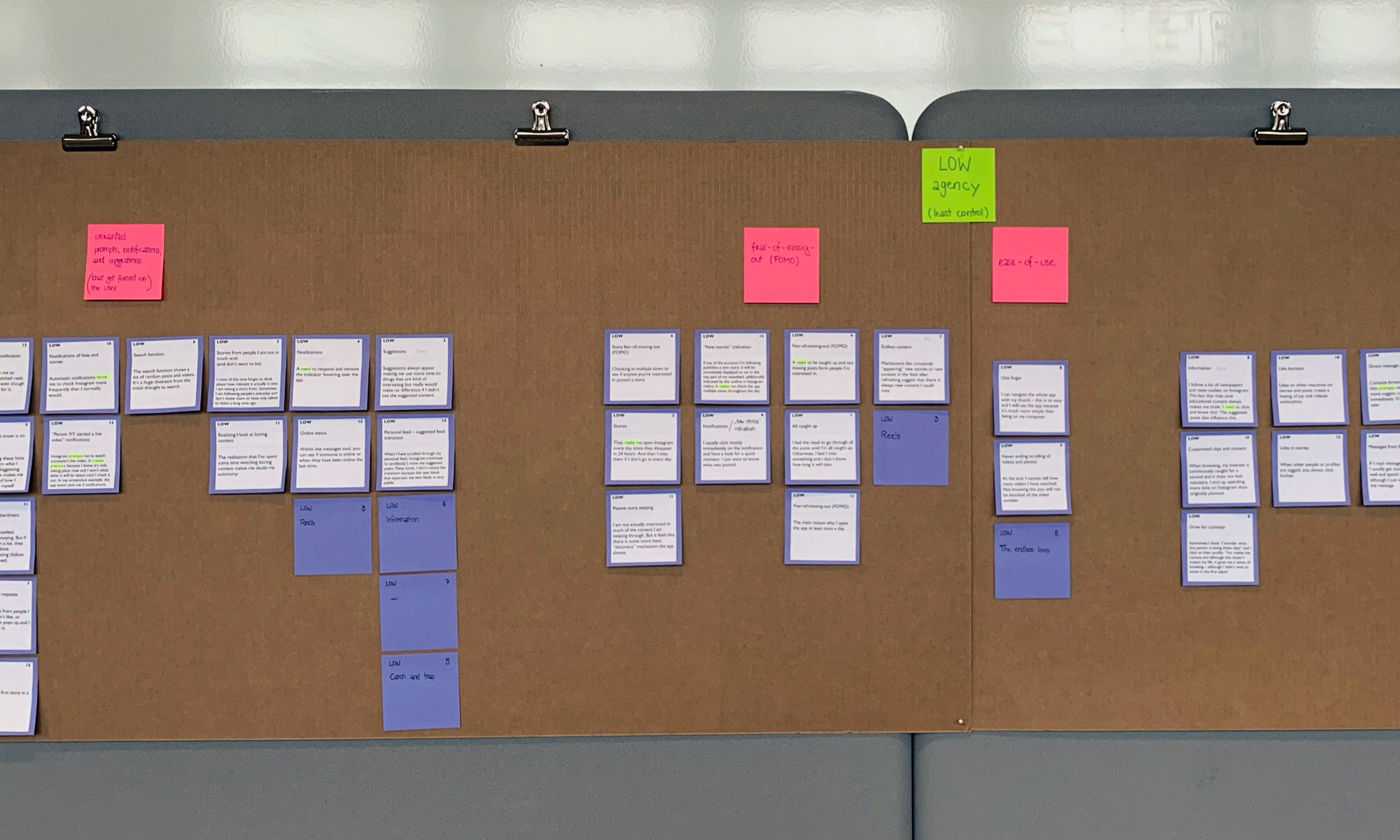
I used affinity diagramming to analyze and synthesize the data gained from my probes studies. Affinity diagramming is a technique used to organize and make sense of large amounts of unstructured, far-ranging, and seemingly dissimilar qualitative data 3. I therefore found it a suitable tool for analyzing the fragmented and unclear nature of my probe study results.
The final affinity diagram included 89 (89%) of all responses, grouping them into several clusters (pink labels) and two overarching themes (green labels) (see figures).
Iterations
Analyzing and clustering data on your own is difficult.
After asking a second person for feedback, I discarded my first affinity diagram and started from scratch.
The affinity diagram revealed distinct design mechanisms that influence user sense of agency in the Instagram app. They can be classified into 6 higher-level design patterns that describe how these design mechanism support or undermine user control.
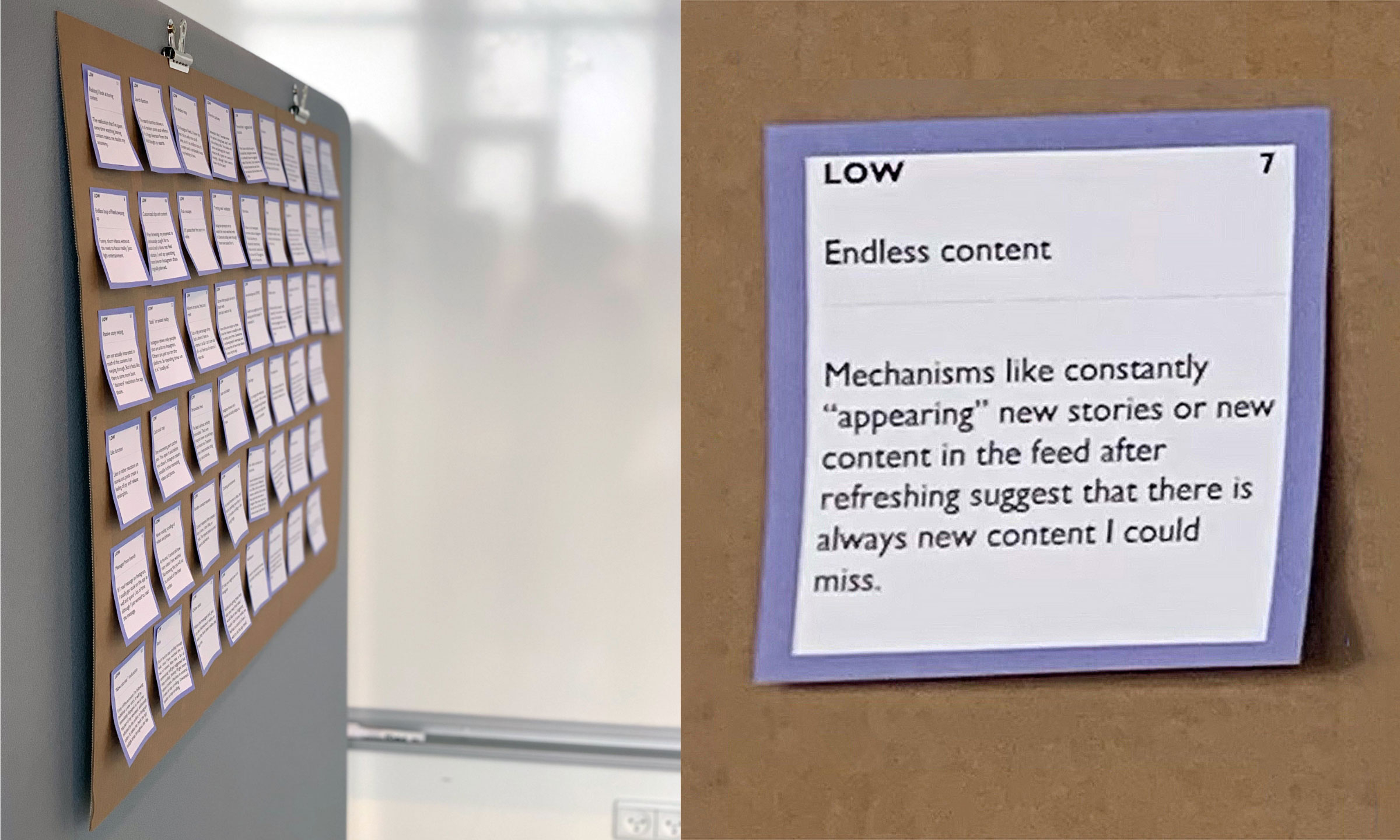
One example for such a higher-level design pattern for low control is the imposing design pattern (see figure). Imposing design patterns include design mechanisms that impose unwanted information on a user. Notifications and Ads were the two design mechanisms that undermined user agency most by being too imposing. The corresponding response from one participant stated:
“Trending reels notification – Instagram prompts me to watch the most watched reels in Denmark today even though I have never asked for it.”
Finally, I condensed my Define phase results into a actionable problem statement, the so-called Point of View (POV). The POV brings the process of understanding the problem to an end and at the same time acts as a link to the following Develop phase:
Instagram users need to be more in control over how they spend their time in the Instagram app because current design mechanisms undermine their sense of agency, thereby deteriorating user well-being. This happens in four ways: by imposing unwanted information on users, by showing highly personalized content, by creating fear of missing out, and by determining the ease of an interaction.
IV. Develop: designing to support user agency
The Develop phase of my research process related to the second research questio – i.e., what are alternative design mechanisms in the Instagram mobile app that might support sense of agency?
Picking up on the insights articulated in the POV, I first developed four How might we (HMW) questions. I used them as design challenges to foster the exploration of new ideas, concepts, and solutions. For example, regarding ease-of-use design patterns, I formulated the following HMW question: how might we redesign design mechanisms that determine how easily users can interact with the interface?
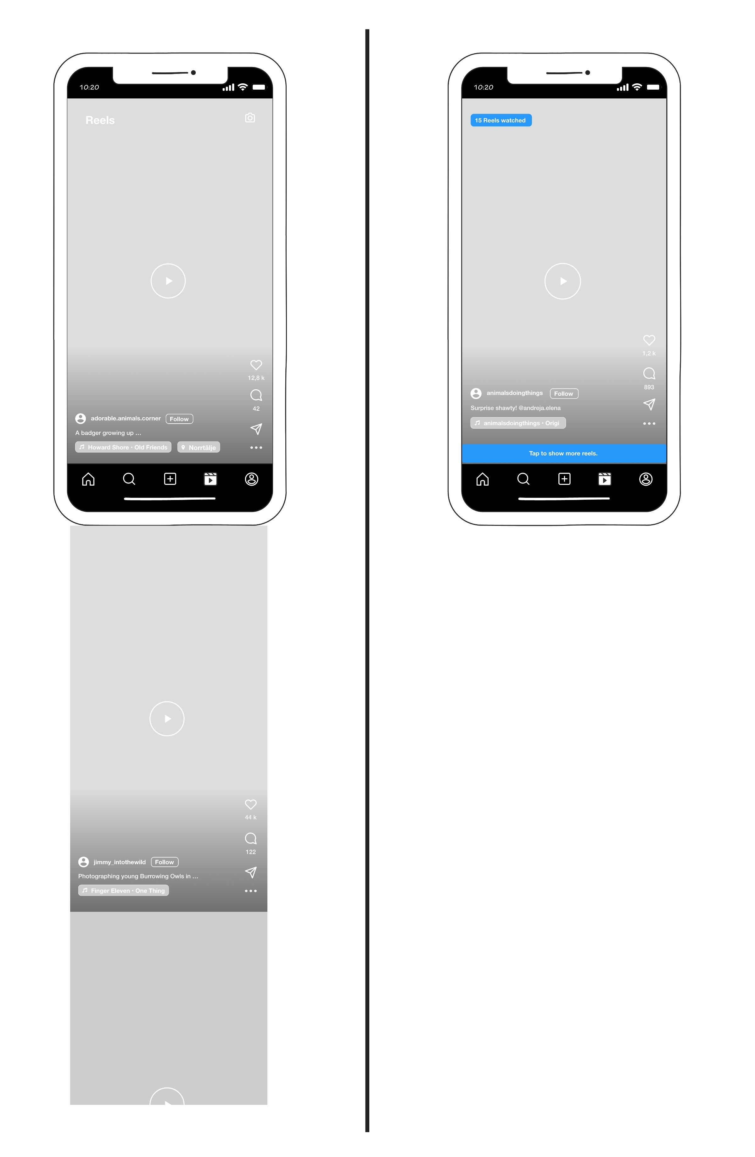
I then used experience prototyping to develop solutions to these four HMW questions. For example, one experience prototype was a redesign of the Reels mechanism (see figure). It addressed the challenge mentioned above of redesigning ease-of-use patterns for a greater sense of user agency. The redesign focused on how easily users were able to see and consume new content. Results from the probe studies had shown that the frictionless design of the Reels mechanism undermined user control. More specifically, the ease of the scrolling gesture entrapped users in an “endless loop of content”, making it hard for users to stop seeing more reels. Therefore, my experience prototype did not feature continuous scrolling but instead included a microboundary.
Learnings
Ideating on your own is tedious and lacks valuable feedback and inspiration from others.
Here, this left me with insufficient time to test my prototypes.
Outcomes
My probe study results identify six design patterns that describe how design mechanisms on Instagram support and undermine user control. Most notably, existing design mechanisms on Instagram made participants feel low in control in four ways: by imposing unwanted information, by showing highly personalized content, by creating fear of missing out, and by determining the ease of an interaction.
Based on these findings, my experience prototypes explore alternative design mechanisms that might support user sense of agency. They constitute redesigns of the following four design mechanisms in the Instagram app: Notifications, the General app UI, Feed & Stories, and Reels. The prototypes present best practices in how to design for greater user agency.
However, ideating and developing these prototypes did not involve any co-creation activities. Future studies are needed to validate whether the redesigns successfully support digital well-being.
Footnotes
Delaney, L., & Lades, L. K. (2017). Present Bias and Everyday Self-Control Failures: A Day Reconstruction Study. Journal of Behavioral Decision Making, 30(5), 1157–1167. https://doi.org/10.1002/bdm.2031 ↩︎
Lukoff, K. (2022). Designing to Support Sense of Agency for Time Spent on Digital Interfaces [PhD Thesis]. University of Washington. ↩︎
Hartson, H. R. (2012). The UX Book: Process and guidelines for ensuring a quality user experience. Morgan Kaufmann/Elsevier. ↩︎