Redesigning a website for a federal state in Germany
Based on workshops and interviews, I developed a clickable prototype and a design specification document.
Team
We worked in this project in a team of 5. My colleagues were design thinking facilitators while I was solely responsible for prototyping, design and technical feedback, and the final hand-off. I also co-facilitated workshops and analyzed interviews.
Duration
9 weeks.
Process
Clusterportal In A Federal State aims to foster cooperation and innovation between companies and businesses in the state.
The website’s core service is a database listing all cluster initiatives, clusters and state-wide networks in the federal state. Complemented by information on funding programs, industry news and persons to connect, the website aims to enable regional businesses to master transformation challenges and structural change.
However, the website’s current appearance is far from being called innovative.
For this reason, the state’s ministry of Economic Affairs asked us to develop a redesigned Clusterportal. We put together a 9-week long design thinking process which involved all relevant stakeholders. Rooted in this user-centered approach, we aimed to develop the content, structure and requirements for a redesigned Clusterportal.
The kick-off workshop reveals: this project is more than just a design refresh.
As expected, the workshop participants described the current design of Clusterportal as outdated, too text-heavy, and not intuitive. Beyond that, we identified an even more profound problem: it was unclear to our client whether and how different stakeholders were using the website. Moreover, they were undecided as to whom the website should address at all. We therefore had the participants work with context & stakeholder maps as well as HMW questions, defining the status-quo, target groups and objectives.
“80% of the content is not relevant for me”: Stakeholder interviews shed light on current usage, pain points and needs.
We conducted 10 semi-structured interviews with representatives of all three target groups – that was, cluster managers, business development managers, and company representatives. They commonly voiced the following concern: Clusterportal comes across as a self-promotion campaign for the state instead of meeting the needs of information seeking, networking and exchange.
Learnings
Recruiting (the right) interview participants requires considerable time and effort.
We had 3 weeks to come up with a suitable interview guide based on the workshop results, recruit participants from all three target groups, conduct interviews, and analyze them. It turned out that 2 stakeholders – business development managers and company representatives – were not easy to recruit. Given the tight schedule, we were thus able to interview much fewer people from these target groups compared to the cluster managers.
We conduct a co-design workshop to move from interview insights to idea generation.
We presented our interview results during a second workshop with our client. Based on these insights, we had the participants develop personas that provided a clear picture of the three stakeholder groups. We then tasked them with sketching a subpage for each target group through card sorting and paper prototyping.
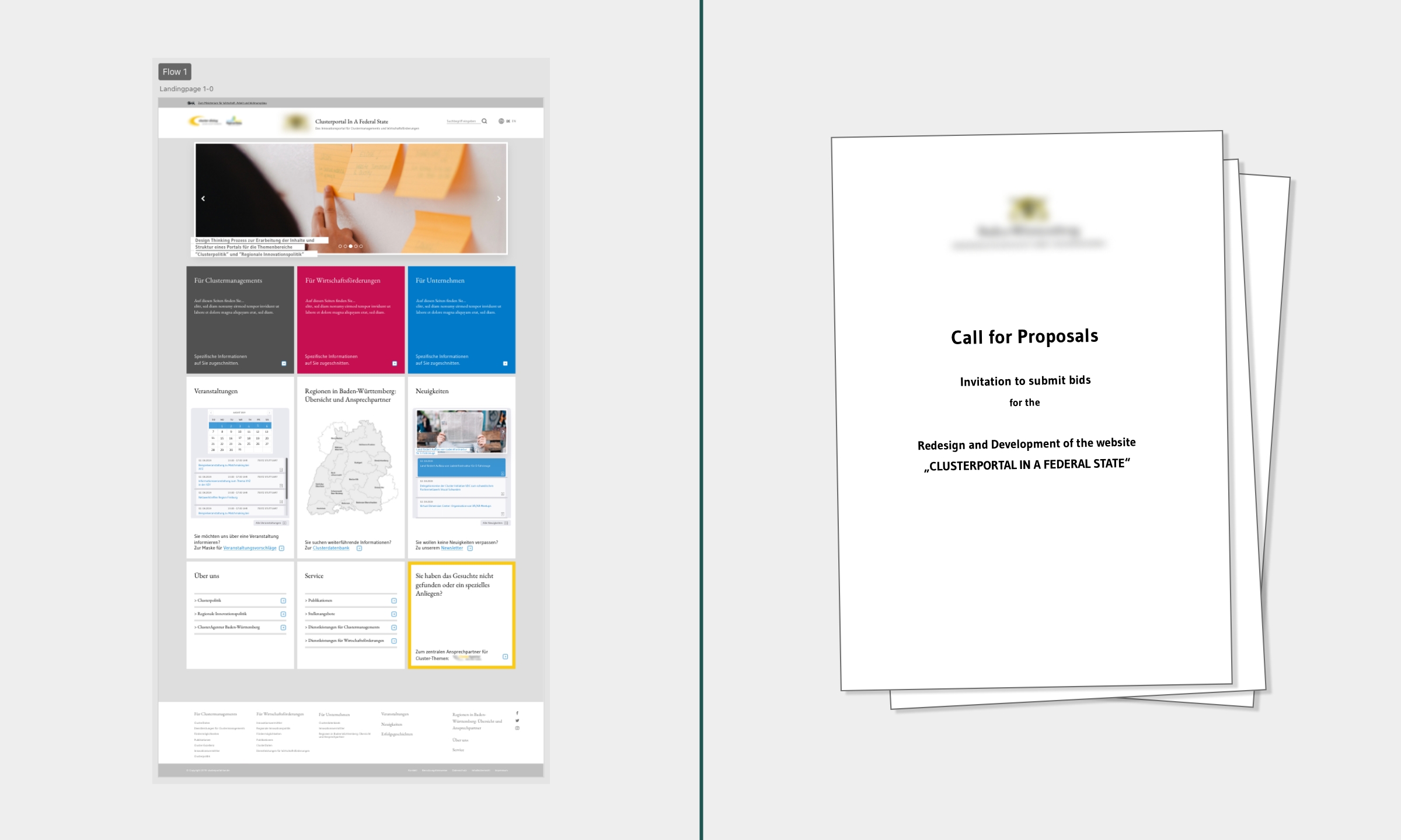
Where my main contribution comes in: Creating clickable prototypes.
I created a clickable prototype that featured a dedicated area for each target group. In doing so, I incorporated the three design suggestions from the workshop. For the overall design, I chose a cleaner and text-reduced card layout because interviewees had criticized the current website as cluttered, counterintuitive, and non-responsive.
After a third workshop of prototype testing and gathering feedback, I am faced with the challenge of creating a final prototype that considers everything we have learned so far.
Meeting the need of all three target groups, the final prototype showcases events, success stories and news prominently on the landing page. I also designed for the needs of each target group. For example, to enable cluster managers to network and market their own cluster, each subpage now features a contact card which includes the person’s profile picture, responsibilities, and main areas of advice.
The outcome: a website prototype and a design specification document
The hand-off was preceded by several rounds of iteration with the client (see challenge). Apart from the prototype, I was also responsible for creating a design specification document as part of the client’s future request for proposal (RFP) for the website’s implementation. The document describes which technical and design criteria the future website should fulfill. The prototype visualizes the information structure and layout of the new website portal.
Learnings
Political interests can hamper a user-centered design.
The client wished to abandon many design suggestions during the final iterations at the end of the project. Instead, the client asked to include and highlight content that had previously been considered too political and irrelevant by workshop participants and interview respondents alike.
Impact
While the website didn’t launch, to track success and impact, I would have monitored the following:
- Happiness:
- Growth in positive feedback compared to previous interviews, indicating stakeholders find Clusterportal well-structured, intuitive, and meeting their needs.
- Engagement:
- Increased overall session length on the website as well as increased page impressions for news, showing that the website is well-structured and shows relevant content.
- Adoption:
- Growth in website visits (unique visitors) and newsletter subscriptions, reflecting more stakeholders discovering the portal.
- Retention:
- Lower bounce-rates, indicating stakeholders find what they are looking for on the portal.
- Task success:
- Increased sign-ups for events and funding programs through the website, suggesting the website is successful in helping stakeholders find and take part in relevant activities.
- Growth in clicks on e-mail & phone links indicating that stakeholders find relevant contact persons to get in touch with.